Designing the Future
SymbaSync
Company : SymbaSync
Platforms: SymbaSync for professionals, SymbaSync Team builder,
Year: 2018- 2019
My Role: UX/UI Designer
Investigating the problem and finding solution
SymbaSync uses a "no bias" system, so people don't have to search for jobs or companies but are instantly paired with the top matches when arriving on the page or updating/completing the profile.
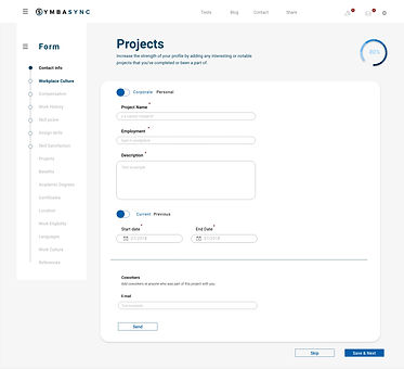
Problem: Detail-heavy forms that take a lot of users' time to fill.
Approach: Make it exciting and keep the user filling in as much information as possible.


Wireframes
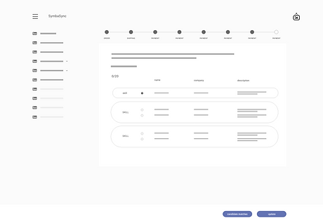
Starting with the low-res wireframes, investigating user flows, and finding the best scenario that works for our users.
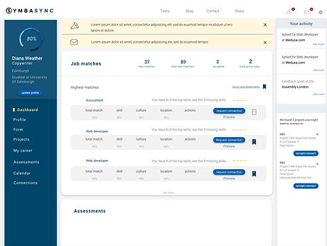
Dashboard design
The dashboard had to be readable but also exciting. To encourage the user to fill more information, we added bits of gamification, such as a progress bar.


User progress
To deal with cognitive load and save users' time, we allowed them to keep their progress and return to the form later.
Don't loose the user
To ensure the users will not get frustrated or bored from filling in too much information on the page, we used the hide feature to prevent text overload and keep the form interesting.
Adding a bit of excitement to the process
Every time the user filled the section, we added positive feedback that motivated the user to keep going. We were also sending feedback on how many job offers are based on the supplied info.

Ready to use
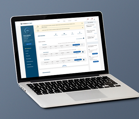
Our product helped build faster, better, and more successful teams with the desired skills. The hiring process was 25% more effective and saved time for both product managers and people looking for the opportunity.

